So, there was a point in the front-end development timeline where websites started to become "responsive", and by that i mean the additional code based on css, javascript, jQuery, or all of the them which gave a website the ability to transform itself when viewed on a mobile device, phone or otherwise. I remember the most popular ones with the Twitter Bootstrap Framework ruling over all others.
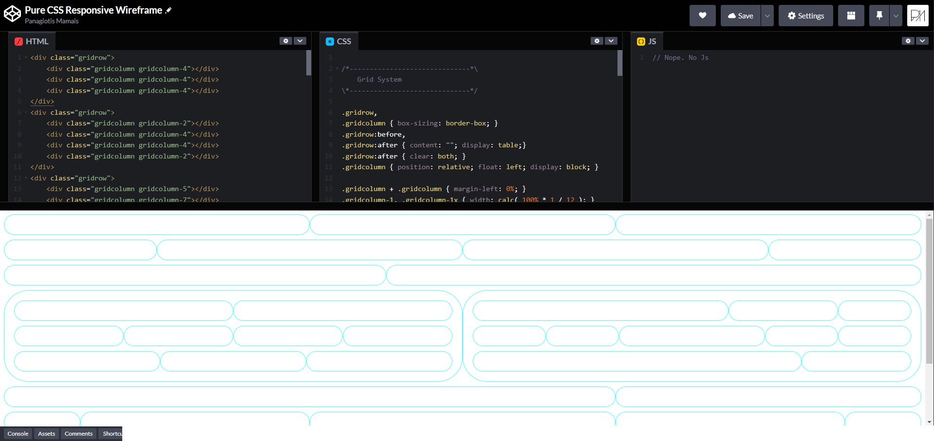
Well, I didn’t care for any of them. Especially Bootstrap. They were overly complicated and heavy with a steep learning curve on the side. So, I decided to make my own wireframe based on pure CSS. Something lightning fast. Compact. Simple and compatible. Self-explanatory.
Got to admit, it took me a couple of weeks with all the testing and such, but when I was done, I started using it in all of my custom websites and I still do. As CSS evolves, I simplify it even more, to the point that today it weighs less than ~30kb and has the ability to not only make everything responsive, but can be altered at will by anyone with basic CSS knowledge to make a website truly adaptive.
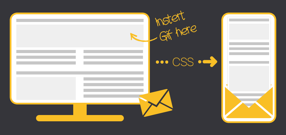
We’ve all opened emails on a phone or tablet where we had to scroll sideways to read everything, or zoom to infinity and beyond were no man has zoomed before, or struggled to click a tiny link, or seen missing blocks of content. It’s paifully annoying!.
Now, you can’t inject just some css and some divs and make it responsive though. E-mails depend on ancient tech and for better or worse, they stayed that way. Tables, rows, cells, and a gazillion rules on what kind of css can run on each and every email client, especially the local ones like outlook. A complete nightmare.
But, if you are as old as I am, you know tables. You know what colspan and rowspan means, especially if you wrote these tags A LOT. So, after intense experimentation, I finally managed to build code that make every newsletter responsive, or even better, adaptive. I am using it for 3 years now and big surprise! It works on outlook too!

